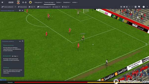
Year after year, season after season, Sports Interactive is eager to present a new version of its famous football management title. Football Manager has risen – for its own merits – in the highest positions of its kind, thanks to a series of mechanics arranged to achieve
the most realistic simulation that exists in the market, to this day. Like every year, the game keeps its most basic features intact, adding a series of interesting improvements
and new features. And those of this season have been directed in two different ways. On the one hand, new possibilities for interaction with staff, workers and the press. On the other, a slight remodeling of the user interface.
It should be noted that, if you compare point to point each renewed version with its equivalent of the previous year, Football Manager seems to limit its progress a lot. His giant steps are only fully appreciated when we move the focus away a little. And perhaps, t
his perception of the dropper improvements is the biggest detriment that the title causes itself, when a player does not find justification to update his version
for the current year. The simulator does not undergo drastic changes every season. Therefore, our assessment today will take into account the whole game, although we will place special emphasis on the novelties presented for the new season.
News that, on the other hand, are evident from the moment we started the game, and is that the design change of the user interface is remarkable. To begin, add an options bar on the left side of the screen, with quick access to the main tasks of our work as a manager:
Mailbox, Template, Calendar, Competitions, Sub-21 and Sub-18 Templates, Tactics and Equipment and Employee Reports, Training, Ojeo and Transfers,
Club Information, Directive and Economy . This shortcut bar becomes a very comfortable tool, which greatly improves the gameplay of the title by avoiding the passage through different screens to reach the objective information.
The changes are not there, because Sports Interactive has also introduced new visual aids so that this information is highlighted at a glance. Explanatory icons are added on some screens, and some values -such as the suitability of a player in a certain
tactical position- are represented with new indicators that greatly facilitate the understanding of the situation. In this last one almost, for example, we will have the figure of a star surrounded by a circle of color. The larger the colored segment of the shape and
according to its color, the player will perform better in that position. If we leave the point above, the explanation will be complete.
The navigation is still that of other years, based on hyperlinks, although this time some of the options can appear as secondary elements in drop-down menus, which are shown from one of the main options. For example, the Preparted link can be extended to show access to more information about the topic. Thus, by accumulating options and much more data visually to reduce
the amount of text on screen, the interface has a much simpler and friendlier appearance than in previous versions. They offer the same amount of information, but reorganized and more intuitive. Although we are used to its appearance in previous versions, we are accustomed quickly.
The news continues in the field of playability, and that is that Football Manager 2015 adds new forms of interaction during the game. Everything will begin when we give up a coach, since now we will have to define additional variables. On the one hand,
and for the first time in the series, we can choose the city of origin of the technician – not just the country – with representation of all those locations that have teams in the game’s database. In addition, this year we will have to define what kind of coach we are,
distributing a series of points between different characteristics, a bit like a role-playing game. This allows us to start with unique coaches, instead of all the initials being the same.


