If there’s one thing that I admire in a developer, it’s a clear sense of direction. I feel like some of my biggest disappointments in gaming over recent years have been titles that shoot for the stars, but barely reach the moon. Overly complicated systems or just too MANY systems.
A metric shit ton of mechanics for the sake of ‘depth’. Unnecessary or unfair difficulty spikes in the name of ‘challenge’.
I feel like it should be common knowledge for a developer that if you want to make a truly great game, it’s best to do ONE thing very very well, and then build around that.
Nintendo have been doing this for years, with many of their games revolving around one solitary mechanic, which they then perfect, and once it’s perfected they built out from it and experiment. Shigeru Miyamoto himself said this was the design philosophy behind the company’s titan franchises.
Now, I’m aware that Thumper actually came out in October last year, and I’m not treating this as a review by any means. But, I did only recently get around to playing it and
I can say that it’s probably one of the best recent titles to illustrate this point. It isn’t a massively expansive roguelike (because every indie is a roguelike), or a bug ridden colossal early access survival game. 9 levels, 2 buttons, no HUD, no story, but an experience that is thrilling, and almost perfect.
*Bwahhhhh* – Thumper 2016
Thumper is rhythm game, but not as you know it. Forget DDR, OSU or Guitar hero, you won’t find cute anime girls or classic jams here. Instead, Thumper is (to me), a horror game. The developers themselves used the term ‘rhythm violence’ to market the game, and nothing could suit it better.
While it may be a simple matter of performing actions either in time to a beat or to their visual representations, Thumper uses a combination of stellar sound design and abstract visual imagery to make the experience gripping.
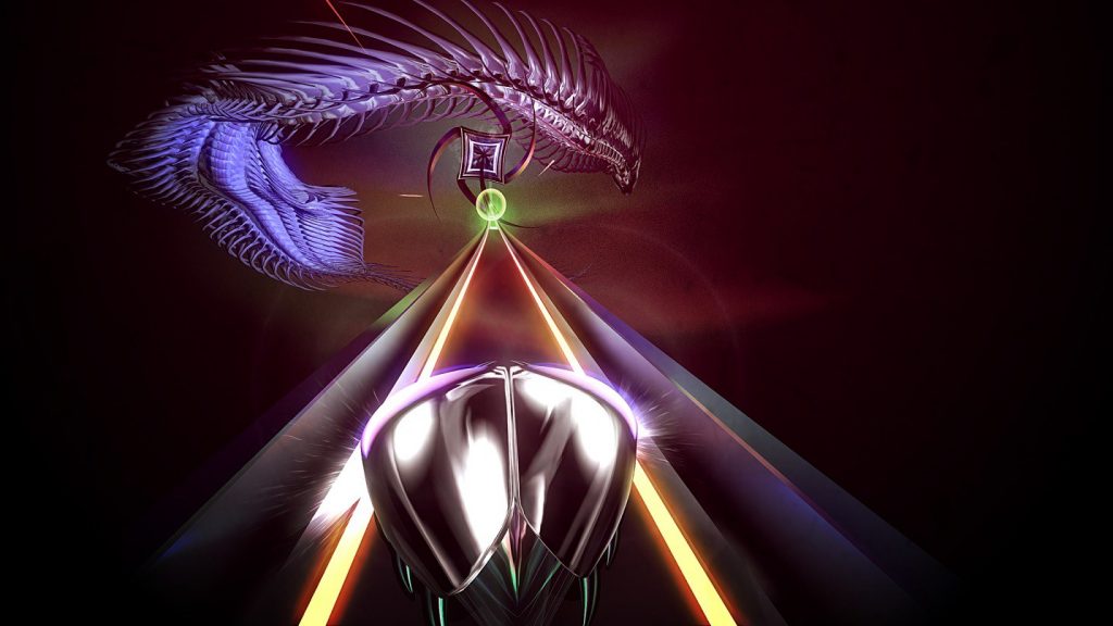
Furthermore, as I mentioned its gameplay only consists of two buttons. But how your character actually controls (the little beetle as shown in these screenshots) and how each different beat or situation has to be dealt with keeps the gameplay fresh and fast, without getting overwhelming at all.
The developers really thought ‘how many different moves and possibilities can we have at the player’s disposal, only using 2 buttons and one ‘track’?’ The answer, is dozens.
Those two things I just mentioned; the sound design and visual imagery, and the gameplay, perfectly illustrate the meaning of substance and simplicity, over style and complexity.
This game COULD have a complex plot and characters, with dozens of hours of dialogue..but the aesthetic and sound of the game is infinitely more recogniseable and interesting than 90% of the indie games on steam. Most likely because it isn’t using pixel art.
Thumper comes down to clean lines, shapes, soft colours and abstract forms, and I think that’s what makes the game so easy on the eye.
From watching gameplay, you’d think it would melt your eyeballs, but actually you can play it for very long amounts of time and your eyes relax into it, due to not having to focus on ‘real’ images.
In terms of it’s sound design, which I don’t need to sell you on as it’s won multiple awards, is also similar in that regard. This isn’t some multilayered, bombastic orchestra piece you’d find in the Marvel MCU or a Dark Souls boss. Without wanting to sound like a broken record, it’s simple, but frighteningly effective.
The game maintains this slow and constant ‘war drum’ esque sound that chugs the entire game along.
Rapid electronic sounds and the sharp, visceral thumps and shrieks of hitting the actual ‘notes’ make the game just ooze atmosphere. And that atmosphere, while pretty damn scary, is infinitely more captivating and cool. Also each note you hit is called a ‘kill’ by the game, just to make it that little bit more badass.
The Thesis
Thumper isn’t the only game to succeed in this field, not by any means. Furi, Super Hexagon, VVVVVV, and countless others are games I would place under the same umbrella.
All of these games teach us this important lesson that is tried, tested and proven, but still goes unnoticed. Many games, especially AAA’s, seem to be full of padding. Skill trees, stats overload, heavy levelling, massive open worlds, cutting edge graphics (at 30 fps of course), but they aren’t put there with a sense of direction.
All of those things have every right to be in a game that is designed and directed with them in mind, such as something like Civilisation or a deep RPG like Witcher 3. But in many cases, they’re put there because..well it’s a AAA game. We NEED a skill tree, idiot.
For example. Think about what a different, and infinitely more interesting, game No Man’s Sky could have been if it was just set on ONE planet full of secrets, monoliths and alien races.
Weapons to craft and places that an actual HUMAN designed to explore full of treasures and intrigue. But instead, more time was invested into making it this ‘massive infinitely sprawling experience’, and it heavily suffered from it.
The fact is, is that Thumper gave me more of an emotional response than the vast majority of AAA’s out there right now, as did Super Hexagon.
Absolutely no form of any sort of story whatsoever, but my own personal rises and falls within the gameplay combined with the aesthetic and music just make the experience memorable.
I fondly remember the feeling of passing Hyper Hexagonest and just yelling ‘YESSSSSSSSSSSSSSS’. I know that feeling of hitting a perfect run of notes in Thumper and having the game’s audio and visuals just make me feel like a badass because of it. Do I remember that one time I shot some people in Uncharted…?
Not particularly.


